A PERT chart can help you manage your project. But what is a PERT chart and how does it assist project managers when they’re working on larger, more complex projects?
What Is a PERT Chart?
PERT is an acronym that stands for Program Evaluation and Review Technique. It’s a statistical tool that can be very useful when working on a project, as it analyzes and represents the project’s tasks.
A PERT chart is a tool that can help project managers schedule, organize and coordinate tasks in their projects. It’s a graphic representation of the timeline of a project, which gives project managers the tools they need to breakdown each of the project’s tasks for analysis.
There are milestones for the project indicated on the PERT chart by triangles. Circles represent the individual tasks and are connected by lines to show the duration of that task from start to finish. These are called nodes.
The PERT chart is used by project managers to estimate the minimum amount of time that will be needed to close a project. This is done by examining the breakdown of the project and the connections there are between tasks, which also helps determine the amount of risk inherent in the project.
One of the purposes of a PERT chart is to help project managers get a handle on complex projects. The nature of the PERT chart and its breakdown structure help to take the complexity of a project and its many parts and visualize the dependencies between each step in the process.
History of PERT Charts
PERT in project management has been around for a while, but it in fact was developed in the U.S. Navy. In 1957, its Special Projects Office created the PERT chart to assist in its Polaris nuclear submarine project.
Since then, it’s found a home in all manner of industries, even the 1968 Winter Olympics in Grenoble.
PERT diagrams and the critical path method came about at roughly the same time, growing from the scientific management founded by Frederick Taylor, also called Taylorism, which was later refined by Henry Ford. But the use of the term critical path comes from DuPont, which developed the method also in the late 1950s.
The problems that a PERT chart has evolved to solve are myriad. They help plan realistic timetables for projects and identify the critical path. They also help project managers see which tasks can be done at the same time. If the project schedule is shortened, the PERT chart points to tasks that can be compressed, and it helps to show tasks that are not critical.
Creating a PERT Chart
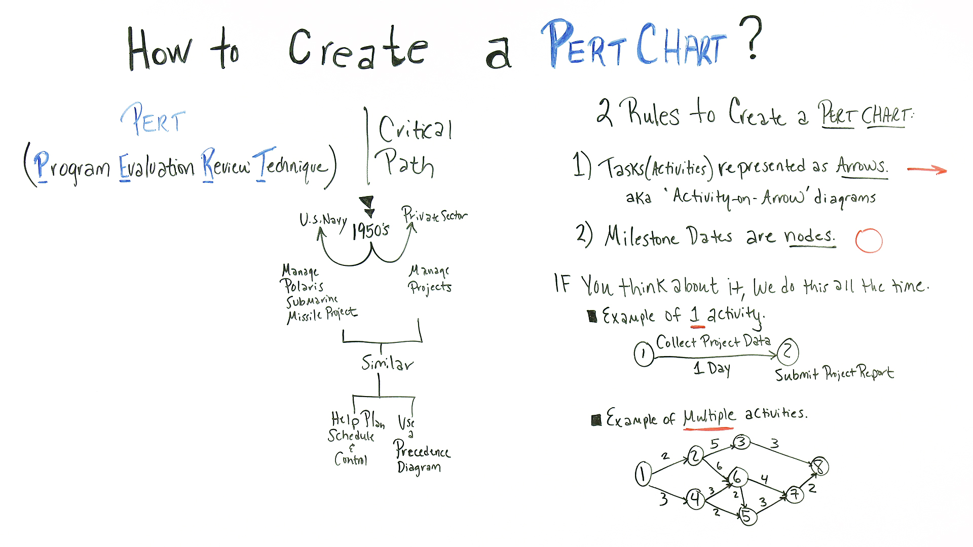
When creating a PERT chart tasks, or activities, are represented as arrows on the diagram. The dates of project milestones are represented as nodes, or circles.
A PERT event is a point that marks the start of completion of one or more activities.
There are also predecessor events, which occur immediately before some events, and a successor event, which naturally occurs afterwards.
PERT has four definitions for the time required to accomplish an activity:
- Optimistic Time: The least amount of time to accomplish a task or activity.
- Pessimistic Time: The maximum amount of time to accomplish a task or activity.
- Most Likely Time: The best estimate of how long it will take to accomplish the task or activity, assuming there are no problems.
- Expected Time: The best estimate of how long it will take to accomplish the task or activity, assuming there will be problems.
Terms Related to Using a PERT Chart
- Nodes: These are the symbols used to visualize milestones and project tasks.
- Arrows: Visual representation of the sequence of a task, diverging arrows indicate tasks that can be completed at the same time.
- PERT Event: The start or end of a task.
- Slack: The amount of time a task can be delayed without causing an overall delay to the project or other tasks.
- Critical Path: Charts the longest path from beginning to the end of a task or event.
- Critical Path Activity: An activity with no slack.
- Lead Time: How much time you should complete a task or activity without impacting the following ones.
- Lag Time: The earliest time in which to a task can follow another.
- Fast Tracking: Working tasks or activities at the same time.
- Crashing Critical Path: Shortening the time of a task.
Steps to Implementing a PERT Chart
- Begin by identifying the project milestones and then break those down into individual tasks.
- Then figure out the sequence of the tasks.
- Make the PERT diagram.
- Do an estimate for each task and the time it will take to complete it.
- Calculate the critical path and identify any possible slack.
- Finally, the PERT chart is a living document that must be returned to and revived as needed when the project is in progress.
PERT Chart vs. Gantt Chart
While both PERT charts and Gantt charts are visual tools used by project managers to control tasks scheduling, they are not exactly the same thing.
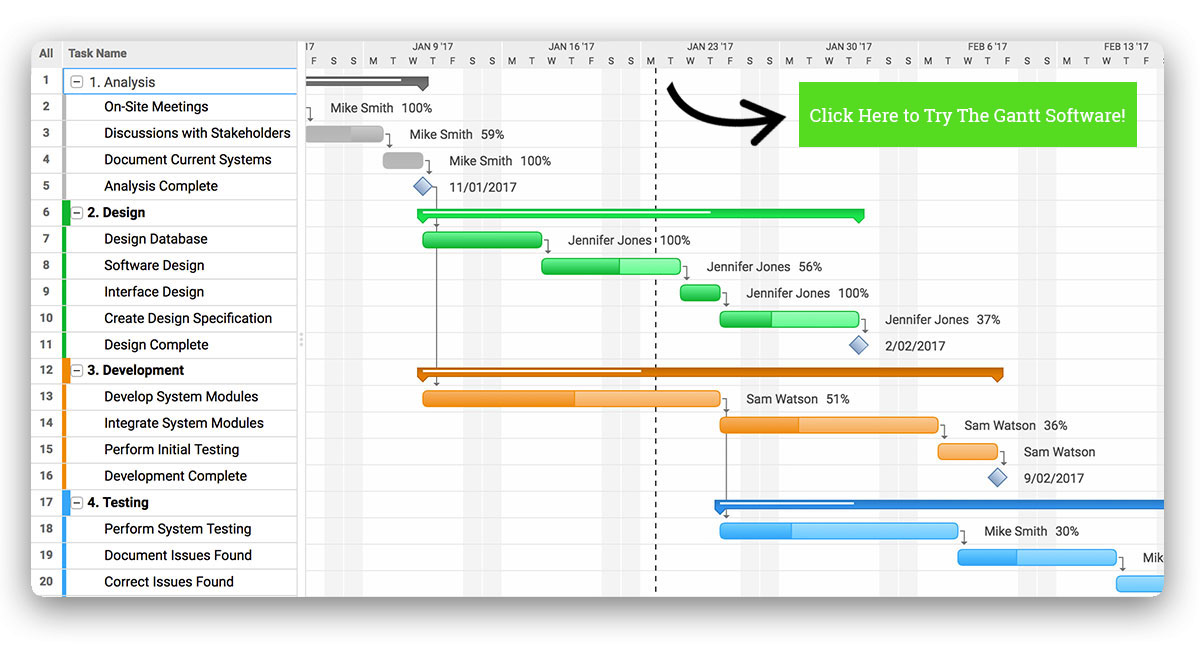
PERT charts, as detailed above, were developed to simplify planning and scheduling larger and complex projects. A Gantt chart is also a graphical depiction for planning and scheduling a project, which breakdowns works down into tasks that populate a timeline. A Gantt chart can set task dependencies and shows the duration of each task.
If that sounds similar, there are differences. For example in a Gantt the timeline is represented by a bar chart, while a PERT is more a flowchart or network diagram. Gantts tend to be used in smaller projects, while PERT charts are for larger and more complex projects. Dependent tasks are linked on a Gantt while a PERT has many interconnecting networks of independent tasks.
However, PERT charts are usually used before a project to figure out scheduling and Gantt charts tend to follow into the project, highlighting scheduling constraints. The Gantt chart can be used when executing the project as well as when planning because tasks start and end dates can be edited. Gatt charts reveal how long each task will take, show who on the team is responsible for those tasks and generally are a more transparent tool to track progress.
Pro-Tip: PERT charts can be used prior to executing the project. They’re a great way to help you estimate simply and more accurately. Estimates can be overly optimistic or pessimistic, but using a PERT chart will find the most realistic estimate.
ProjectManager.com and Project Scheduling
The PERT chart is a tool that helps plan and schedule, but ProjectManager.com has an online Gantt chart that plans, schedules and works through the execution of the project. Our Gantt gives you control over every aspect of your schedule, from placing milestones, assigning team members and linking dependencies. Teams can collaborate at the task level, commenting and attaching documents. As issues arise and start and end dates change, simply drag and drop the duration bar.

PERT Chart Example Video
PERT charts help you manage complex projects, but they can be a bit hard to understand. If you want a different perspective, watch project management expert Jennifer Bridges, PMP, as she walks you through the steps of creating a PERT chart in this short tutorial video.
Want to know what a PERT chart is and how it can help you manage your project? Jennifer Bridges, PMP, shows you.
Here’s a shot of the whiteboard, and a PERT chart example, for your reference!

Transcription:
Today, we’re talking about how to create a Pert Chart. So Pert stands for Program Evaluation Review Technique. It’s been around for some time, it was actually created in the ’50s by the U.S. Navy to manage the Polaris Submarine Missile Project.
Around the same time, the private sector created a similar technique called the Critical Path technique that you probably heard of as well on the project management arena. But they’re very similar, they both helped to plan, schedule, and control projects, and they both use a precedence diagram in their technique.
So there are two rules to create a Pert Chart. The first one is the task, or the activities are represented in the diagram as arrows, which I’ll show you in just a moment. and you may have heard this in the project management arena, it’s called the activity-on-arrow diagrams because, in the graphical depiction, or the diagram, the activity is literally sitting on the arrow.
The second rule is that the milestone dates are represented as nodes, and again, I’ll show you both. But if you think about it, we do this all the time not only in our daily lives but in our project management life.
So if we take one activity and show it on a Pert Chart, we have collect project data is the activity, so it’s sitting on the arrow. And these are the nodes. The estimate of time to do this is one day, so we have to collect the project data before we can submit the project data. So this is a simple one activity depiction.
So if we expand this out to an example with multiple activities, we can see that the circles are the nodes, those are the milestone dates, and then the arrows are the activities.
So the numbers sitting on top of the arrows, that’s the estimate, a duration of time it takes to complete that activity. And then also if you look at these, you can see that when this milestone is done it can initiate multiple activities. In this case, activity, these two activities are initiated when that one is complete.
So that’s why we reference a precedence diagram, so precedence diagram means that something has to proceed that activity being done. But as you can see, it can become quite complex, and some people can still do this manually, but it helps tremendously using a tool.
So if you need a tool to help you with your Pert Chart, then sign up for our software now at ProjectManager.com.
(This post updated December 2019)
No comments:
Post a Comment