
Earlier this year, my company worked with the executive team at a major health care provider to reimagine the way it delivered its story to new audiences.
The CEO of this company was a real numbers guy — and rightfully so. The numbers clearly proved that his company was the right choice for patients, providers, and the health care system at large.
He understood the value of this data set and saw how it could persuade his audience. He had an entire research team dedicated to gathering data and readying new materials in advance of any meeting with a prospective partner.
But the slides in his slide deck — chock-full of charts and tables — weren’t working. They failed to present the data’s story in a way that audiences could easily, instantly understand. (See “Without Annotation, Charts Are Missed Opportunities.”) The research team was exhausted from re-creating the same types of ineffective slides over and over again.
On first glance, these graphs aren’t terrible. Most presentation software today plots clean, simple charts.
What the software doesn’t automatically do is annotate those charts well.
Here’s the problem: When faced with a slide that presents a lot of new information, our brains instantaneously assess how much effort we’ll have to exert to make sense of it. Does the slide have too much information or look difficult to process? If it does, we disengage. This is because of perceived cognitive load, or the amount of mental effort we believe is required for us to learn new information.
By overlaying visual annotations on charts and graphs, you feed your audience members insights they can understand at a glance — and that’s invaluable. Visual annotations guide viewers’ eyes straight to the point instead of making them seek it out, either amplifying a single piece of data or illustrating the relationships among several data points.
These simple, subtle additions lessen the load for the audience. By steering your audience members toward the key insights, you invite them into the story your data can tell.
Visual Annotations Prioritize What’s Important
You don’t have to be a professional designer or a data visualization wizard to master the magic of annotating insights. Instead, you just have to add simple visual elements as a supplementary layer — like an overlay on a physical chart — to explain the most pertinent details in an elegant way.
I’ll let you in on a few favorite tricks.
First, you want to make sure you choose the right type of chart. As I wrote in an earlier column, complex charts are good for exploring data, but classic charts (that is, a bar chart, line chart, and pie chart) are better for communicating data.
Second, to decide the best way to annotate your chart or graph, you’ll need to identify the main insight you want your audience to instantly take away.
Here are five specific annotation strategies you can use:
1. Highlight data.
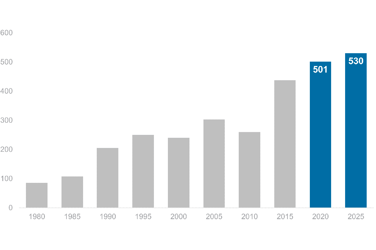
One way to amplify data, or draw attention to a single data point, is to highlight a piece of it. An easy way to do this is to put that piece of data in a contrasting color.
In the example here (which we’ve anonymized to protect client data), the color blue is used to create emphasis. You’ll want to keep all the other elements in neutral shades so they fade into the background. With a single color, you can draw the eye to one point on the slide instantly. (See additional examples, plus before-and-after makeovers, in “Five Annotation Strategies That Will Make Your Charts Stand Out.”)
2. Label data.
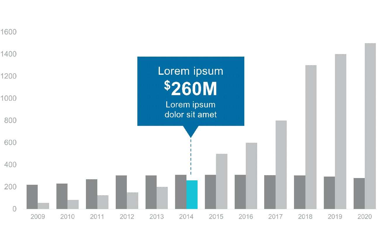
If you want to make sure a specific number isn’t overlooked, make it huge. Use a graphical element such as a bubble or large type to mark your most important data. This will ensure that the viewer doesn’t miss your point.
Other times, you might not want to emphasize a single data point but instead want the viewer to make connections among several points. In these cases, visual annotations that spell out the math you want to highlight will make it easy for an audience to understand the story the data is telling.
3. Bracket data.
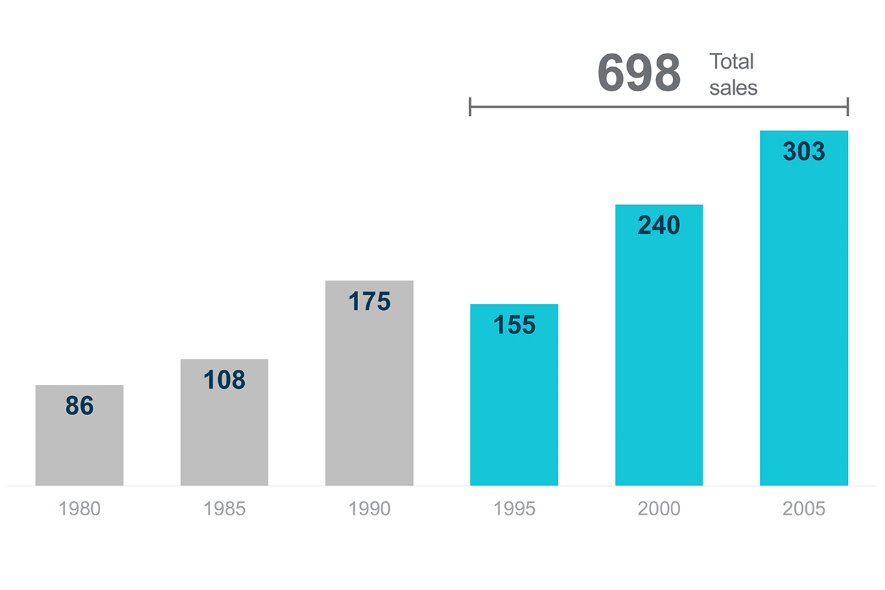
When you overlay a bracket onto a chart, you visually connect two or more data points; then you can add them together, subtract to calculate the difference, or calculate an average. In the case of a pie chart, a bracket can be used to add pie segments together. As with labeling data, the point is to do the math you want to highlight. Support your audience members by doing the work for them.
4. Delineate data.
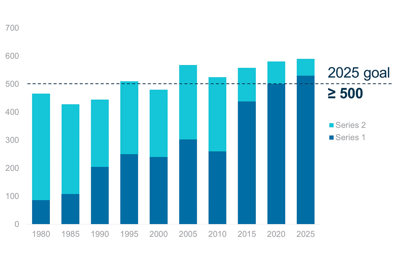
Overlaying a benchmark or goal line onto a chart — a horizontal line that shows some data below it and some data above it — can draw attention to where the data shows underperformance and overperformance. You can add in numerical details to show precisely how much above or below the goal each data point is.
Lines can also show the percentage achieved toward completion or highlight the amount left to go.
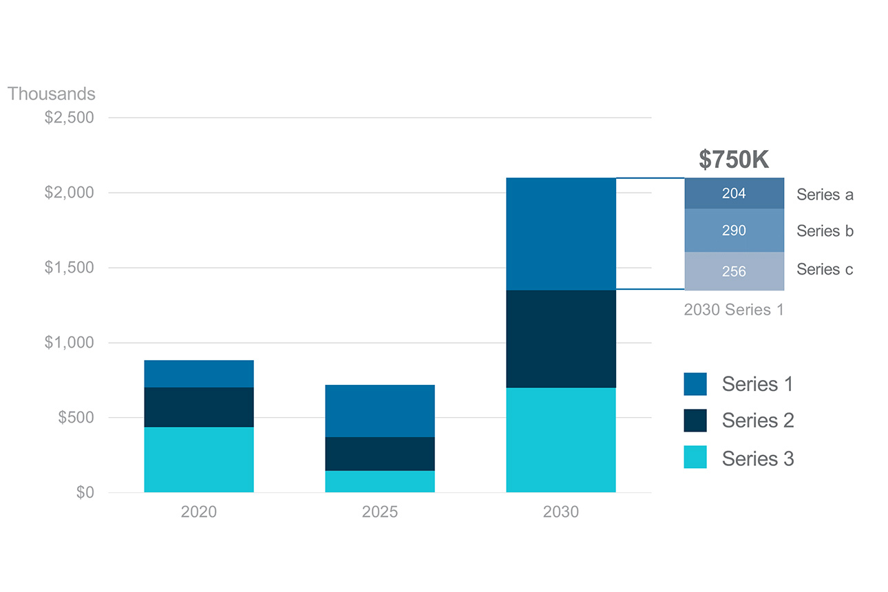
5. Explode data.
Some data has important subcategories. To break out deeper segmentation within a particular data point, “explode” its details into an attached, secondary chart. In that new chart, you can highlight the key subunits in different colors.
Clarity Communicates What’s Important
When it comes to sharing key data insights, what you see is what you get.
The simplest visual way to ensure that audiences don’t miss the points you’re trying to convey is to clearly annotate your charts and graphs. Putting the extra effort into making your data’s insights easy to consume — by adding color, math, or bubbles with additional data — demonstrates empathy for your audience. It's one of many ways to use your data to tell a story. If your data is easier to follow, your audience won’t get lost, won’t get bored, and will see the meaning of your charts more clearly.
(See 23 examples, including before-and-after makeovers, in the downloadable PDF “Five Annotation Strategies That Will Make Your Charts Stand Out.”)
Make Your Data Insights Visually Consumable
No comments:
Post a Comment